Combo Box widget
Path: Widget Gallery> Basic> Controls
Use this widget as a selector widget or to filter rows in a table to display only the values selected in the combo box.
| Parameter | Description |
|---|---|
|
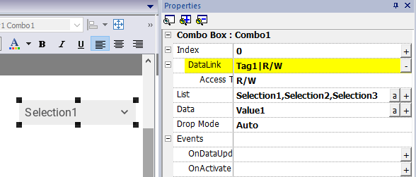
Index |
Index of the selected item. |
|
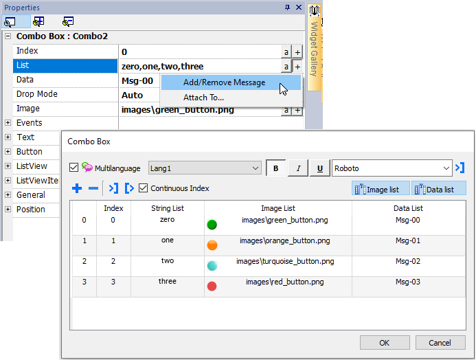
List / String List |
Item strings in the combo box. Note: This field is multi-language. |
|
Data / Data List |
Returns the value in the Data List column (as string) in the Data field of the widget. Tip: Use this parameter to return a custom value based on an item selected in the combo box. |
| Text | Format of displayed text. |
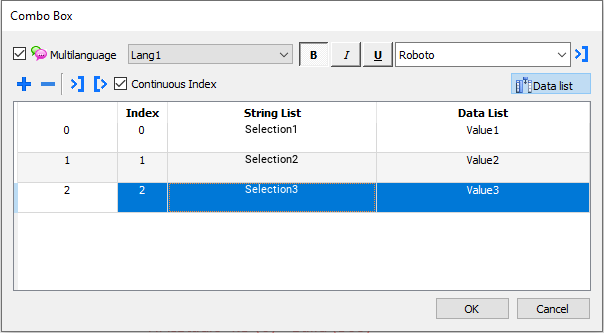
Data List
The Data List is associated with the "listData" property and can be modified dynamically using the JavaScript code.
// To read the Data List var comboWgt = page.getWidget("Combo1"); var listData = comboWgt.getProperty("listData") // To write the Data List var comboWgt = page.getWidget("Combo1"); comboWgt.setProperty("listData", "NewData1,NewData2,NewData3");
Attaching data vs. attaching indexes
In many projects you may need to attach fields such as Index or Data to tags to know the values of the selected item in the combo box. Use:
- Index: to display the index (integer) of the selected item (0...n).
- Data: to display the data value (string) specified in the Data List column.
Combo Box widget “full screen” mode with images
From the "Project properties" the look and behavior of Combo Boxes can switches from Context mode to Full Screen mode
Path: ProjectView> double-click Project properties> Properties pane> Project> ComboBox View Mode
| Parameter | Description |
|---|---|
|
ComboBox View Mode |
Select the visualization mode of all the Combo Box widgets of the project Context
Full screen
|
Context view example
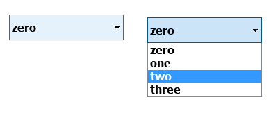
Full screen view example
Additional parameters available in full screen mode
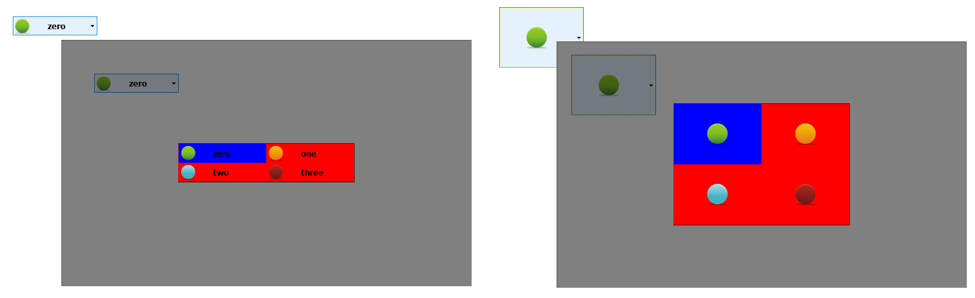
The additional "Image List" column will be available inside Combo Box> List parameter:
Note: Some properties are displayed only in advanced mode.
| Parameter | Description |
|---|---|
| Image | Return, inside the attached tag, the file name of the selected image |
| Button |
Define the look of the Combo Box
|
| ListView | Layout parameters of the Combo Box in edit mode |
| ListViewItems |
Define the items type that will be inside the Combo Box Image Mode:
|
Additional macros available in full screen mode
- OpenComboBox
- CloseComboBox